For this reason, SharePoint is one of the most popular web-based collaboration solutions available today. Many businesses fall in love with SharePoint because of the dashboard, which allows them to see vital business information on a single page with key performance indicators (KPIs). SharePoint dashboards have been transforming the way organizations from many industries exchange information since 2001. It raises the bar for information exchange, increases staff productivity, and creates new business prospects. One of the most popular questions I hear about using SharePoint is how to create a hyper-responsive, beautifully designed, a really coherent dashboard that displays all of the day’s key performance indicators (KPIs), report updates, big data analysis, and business information. There’s no denying that big-picture score sheets may be really useful in conveying your message, and one that’s visually appealing helps everyone, especially senior management, grasp the concept better. Follow through for more information on how to build a beautiful dashboard in SharePoint Online.
Building the dashboard on Excel
While most of us rely on our trusted MS Excel dashboard to run our businesses on a daily basis, many of us struggle to turn that data into something that would pique people’s interests and entice them to learn more about it. So, how do you go about accomplishing this seemingly insurmountable goal? The Excel Interactive Dashboard is useful in this situation. First and foremost, what is an Excel Dashboard before we go into its depths? A dashboard is a visual depiction of the key information that an individual must communicate to a client in order to fulfill one or more objectives, which can be viewed at a glance on a single computer screen. It’s a comprehensive and detailed visual report or analysis of your project that you may share with others.
Step by step process: Building a dashboard in Excel
Create the pivot table and graphs
- To begin, open your Excel spreadsheet.
- Select your data from the sheet now.
- After that, select “Insert” and then “Table.”
- “OK” should be selected.
- Change the name of the table to “Data.”
- Now select “Summarize with pivot table” from the drop-down menu.
- Use the snapshot below as a guide to configuring the information for the final conversion.
- The pivot table should be renamed.
- Pivot Table Fields can be edited.
- Drag and drop dataset data into the proper categories.
- To begin, select “Pivot Table Analyze.”
- Now select “Pivot Chart” from the drop-down menu.
Making the dashboard
- To begin, make a new Sheet and name it “Dashboard” (the name is logical as it is our main dashboard).
- After that, depending on how tall you want your title bar to be, choose the first two or three rows. Now select “Merge and Center” from the drop-down menu.
- After that, you may assign whatever fills you like.
- Now, slide all of your charts around the page, generally positioning them according to your preferences; this phase should take some time.
- Select your chart now.
- Select “Insert” from the drop-down menu.
- Now select “Slicer” from the drop-down menu.
Making the backdrop
- To begin, open PowerPoint.
- Now select “Insert” from the drop-down menu.
- After that, select “Shapes.
- Choose a Square.
- Begin building your dashboard’s spacings.
Formatting the sheet to finish the dashboard
- Return to your sheet and select “Page Layout.”
- Now choose “Background.”
- Adjust the preferences.
I removed the backdrop from the charts and made them colored white, which contrasts nicely with the backdrop, after experimenting with the settings until I achieved the appearance I wanted. Make sure you’ve got the right settings for your preferences once more.
Summary
You’ll need to set it all out in Excel once you’ve determined the relevant KPIs and data to report on. Starting with a pencil and paper is the greatest way to go. Make a rough sketch of how you’ll show your facts. Alternatively, draw on 35 index cards and place them on a table. It’s a lot simpler to play with tangible items than it is to construct them first in Excel.
Do a fast Google search for “business dashboards” and look at the image results if you need some ideas. You’ll see some fantastic examples of what others have accomplished.
This is a rough guide on how to build a dashboard on Excel, this will make data logging a lot easier opposed to having it scrunched into Sharepoint lists. It’s easier to input the data once the file is added you can assign it as a dashboard with the help of an integrated script already built-in Sharepoints online browser, you can directly add the dashboard in.
This was just a rough guide to building the dashboard, be sure to look at our full and complete guide to building the dashboard right here. Click here for the full and complete guide on building a dashboard on Excel.

Adding the dashboard to your site
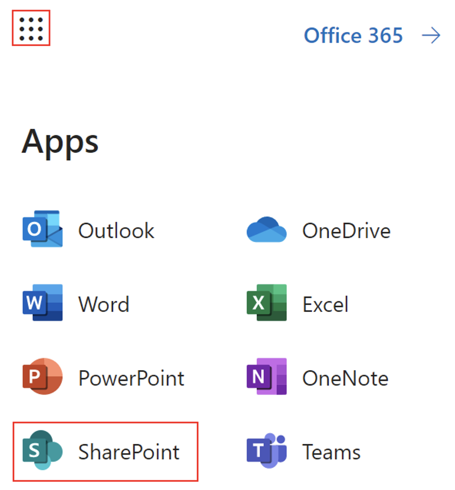
- Firstly, sign in to Office 365.
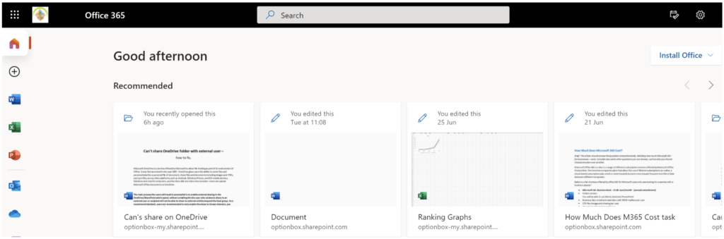
- Use the launcher and navigate to “SharePoint”.
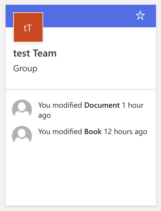
- Now locate your main site from the collection.
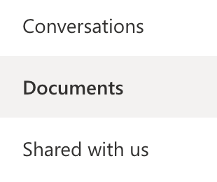
- Once the site is open click on “Documents”.
- After that, drag your new dashboard file into the document field.
- Now you need to open the file and put your cursor in cell A1.

- Now save and close the file.
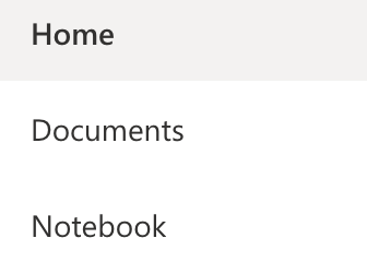
- Create a new page labeled dashboard.
- Click on “Home”.
- Now click on “New” followed by “Page”.
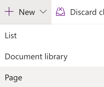
- Select the blank page.

- Then click on “Create Page”.

- Name and describe the page, you can choose to do what you want here.
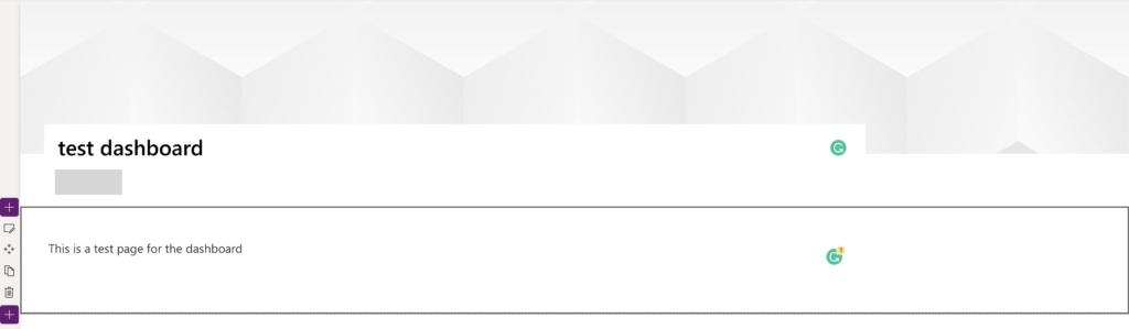
- Customize the initial page.
- Now click on the “+” symbol to add a new web part.
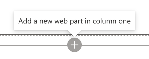
Hover around the web section you’ll find this plus symbol along with this pop-up indicator.
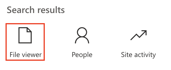
- Select “File Viewer”.
- Finally, select your dashboard file and add it to the dashboard.
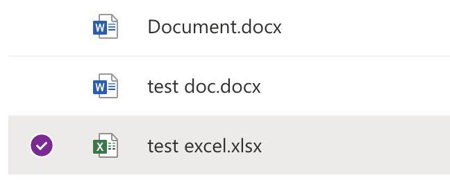
- Now, click on “Add file”

Final results
Barring any edits you need to make to the final result to make the CSS look spot on across all aspect ratios, you are complete and ready to publish your dashboard. Make sure it’s perfect for either your colleagues or clients, don’t be afraid to go make further edits to the dashboard to ensure the file is complete and up to date.
Adding a notes functionality
When looking at KPIs or dashboards, the alternatives I explain in this post essentially eliminate the need for anybody to open or transmit an Excel document explicitly. Because you’re using Excel, you may add graphs, charts, equations, conditional formatting, and so on. Only macros are off bounds.
However, the data cannot be changed in real-time on the screen. Yes, the data is live; that is, the material is as current as of the file it is showing at the time you loaded the page. You may also jump around the workbook’s different sheets. However, you can’t manipulate the data, make what-if modifications, or do anything else on the page. To do so, you’d have to open the file for modification.
What I’ll say regarding “live” editing is that you can edit the workbook using the Page Viewer web element, but the Excel Web Access web part opens Excel in the program on your machine instead of the browser. The Excel Web Access web component has been targeted again.
This is just a method of displaying data on a web portal that many of your colleagues are likely already familiar with, without having to open Excel or another tool. Because a dashboard or a piece of a dashboard may be placed into a department or team home page, a site where people already come on a regular basis, it’s a terrific method to keep the big-picture scores in front of everyone’s eyes.
Conclusion
That’s it for this Blog thank you for taking time out to read our content, please feel free to email our team about how it went if you followed the steps or if you need more help with the questions we answered in this Blog.